Arabic Calligraphy Styles
Ten calligraphic scripts available for the front panel — from the flowing sweep of Thuluth to the geometric precision of Kufi. Each one changes the whole character of the memorial.
Naskh
A foundation of Islamic calligraphy
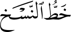

Naskh is one of the most important scripts in the history of calligraphy. Its name comes from the verb nasakha, meaning “to copy,” reflecting its main purpose: preserving and copying knowledge. While scripts like Thuluth were reserved for buildings and titles, Naskh was the script of everyday writing — prized for being clear and easy to read.
Historical origins and evolution
Naskh was established by Ibn Muqla, a calligrapher for the Abbasid Caliphate, who devised a proportional system using the dot (nuqta) to standardise letterforms. Before Naskh, the heavier Kufic script dominated; as the Islamic empire grew, a faster and more legible script was needed. Ibn Muqla refined Naskh into one of the Six Classical Scripts of Arabic.
Nuances and characteristics
- Highly legible — letters are well spaced and evenly proportioned.
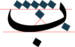
- The nuqta (dot) system keeps letter sizes consistent; an Alif is typically five to seven dots tall.
- Rounded, curved forms rather than the straight lines of Kufic, with smooth letter endings.

The role of Naskh in Islamic culture
Naskh is the script students learn first when studying Islamic arts. For centuries most Quranic manuscripts were written in Naskh, and it was used to record Hadith and poetry in a consistent, readable way. It remains the standard script for printed Arabic books and news today.

Style variations
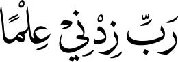
Naskh can be written with different glyph variations while following the same rules. Style 1 uses more elongated, graceful letterforms; Style 2 uses shorter, more compact forms. Both are authentic examples of the script.
Modern Naskh
A contemporary expression of Naskh


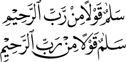
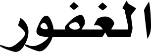
Modern Naskh is a contemporary variation of traditional Naskh. It keeps the readability and balance of classical Naskh but gives the letters a cleaner, simpler appearance — well suited to logos, branding, Islamic artwork and modern typography.
Origins and development
It has no single inventor or specific historical origin. It is a contemporary interpretation developed through modern Arabic typography and digital calligraphy, with different designers creating their own versions while keeping the core principles of Naskh. It became popular as digital design demanded a clean, modern look.
Nuances and characteristics
- Cleaner, simpler letters than traditional Naskh.
- Some elongated forms are shortened for a more balanced composition.
- Smooth, consistent stroke thickness.
- Designed to work well in both print and digital media.
- Keeps the elegance of Naskh with a modern visual style.

The role of Modern Naskh in contemporary design
It is widely used in logos, brand identities, Islamic wall art, social media designs and digital publications — combining tradition with simplicity while staying connected to the principles that make Naskh so respected.

Style variations
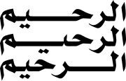
Like traditional Naskh, Modern Naskh can be written with longer, more elegant letterforms or shorter, more compact shapes. Both approaches keep the same modern character while offering different visual expressions.
Thuluth
The crown of Islamic calligraphy
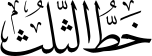
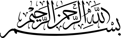
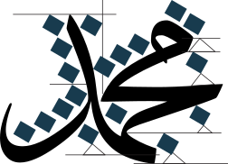
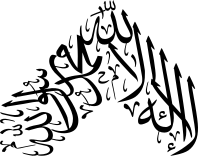
Thuluth is one of the most beautiful and respected Arabic scripts. Its name means “one-third,” thought to refer to the pen-nib proportion used to write it. Unlike Naskh, which was mainly used for copying books, Thuluth was created for decoration and artistic expression — its large letters, graceful curves and elegant compositions make it one of the most admired scripts in Islamic art.
Historical origins and evolution
Thuluth developed in the early centuries of Islam and was refined by Ibn Muqla, then further improved by masters such as Ibn al-Bawwab and Yaqut al-Musta’simi, who perfected its proportions and balance. It became one of the Six Classical Scripts and was used throughout the Islamic world.
Nuances and characteristics
- Long vertical strokes and wide, flowing curves.
- Elongated letterforms that create graceful compositions.
- Strict proportion rules based on the nuqta (dot) system.
- Letters often overlap or interlock into decorative arrangements.
- More difficult than Naskh — it requires a high level of skill and precision.

The role of Thuluth in Islamic culture
For centuries Thuluth has decorated mosques, palaces and important buildings — domes, arches, prayer niches and gateways — because its large letters read well from a distance. Many Quranic verses and religious monuments were written in Thuluth. It remains widely used in mosque decoration, Islamic artwork, certificates and logos.
Style variations
Thuluth can be written in longer, flowing forms or shorter, more balanced ones, and arranged into circular, oval, teardrop or square compositions. Style 1 uses more elongated letters with sweeping curves for a grand look; Style 2 is more compact while preserving the elegance and harmony of the script.
Maghribi
The distinctive script of North Africa
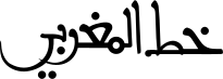
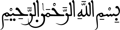
Maghribi is one of the oldest and most distinctive Arabic scripts. Its name means “western,” referring to the western Islamic world — Morocco, Algeria, Tunisia, Libya and parts of Andalusia. Unlike geometric Kufic or balanced Naskh, Maghribi is known for its rounded letters, sweeping curves and expressive character.
Historical origins and evolution
Maghribi developed between the 10th and 11th centuries from early Kufic. As Islam spread across North Africa and Al-Andalus, local calligraphers adapted Kufic into a more rounded, flowing style suited to handwriting and manuscripts. It became the dominant regional script, used for copying the Holy Quran, religious books and official documents.
Nuances and characteristics
- Rounded, sweeping letterforms.
- Large curves and extended strokes.
- Some letters written differently from eastern scripts such as Naskh and Thuluth.
- A lively, decorative rhythm while remaining easy to read.
- Follows traditional proportion rules with a unique regional style.

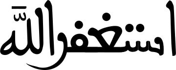
The role of Maghribi in Islamic culture
For centuries Maghribi was the principal script across North Africa and Al-Andalus — used for the Holy Quran, Hadith, scholarly books, official documents, architecture and decorative artwork. It remains an emblem of the calligraphic heritage of Morocco and North Africa.
Ruq’ah
The script of everyday writing
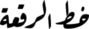
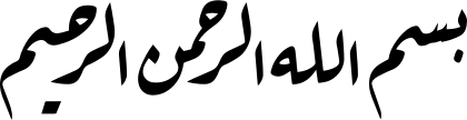
Ruq’ah is one of the simplest and most practical Arabic scripts. Its name means “small sheet” or “piece of paper,” reflecting its use for everyday handwriting. Unlike the highly decorative Thuluth or Diwani, Ruq’ah was developed for speed, clarity and ease of writing — the preferred script for daily communication across the Ottoman Empire and many Arabic-speaking countries.
Historical origins and evolution
Ruq’ah developed during the Ottoman period and was refined by the Ottoman calligrapher Mumtaz Efendi in the 19th century. It was later standardised and adopted for official correspondence, education and everyday handwriting. Easy to learn and quick to write, it became one of the most widely used Arabic scripts and continues to be taught today.
Nuances and characteristics
- Short, compact letterforms.
- Mostly straight, simple strokes.
- Very few decorative elements.
- Letters connect smoothly, making the script fast to write.
- One of the easiest Arabic scripts to learn and read.

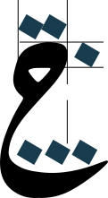

The role of Ruq’ah in Islamic culture
For many years Ruq’ah was used for personal letters, official documents, school lessons and everyday handwriting — the standard in many government offices and educational institutions thanks to its speed and readability. Though less decorative than other scripts, it remains an important part of Arabic writing used by millions in daily life.
Kufi Fatimi
The elegant script of the Fatimid era
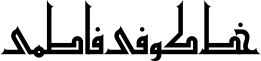
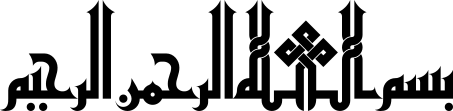
Kufi Fatimi is a decorative Kufic style that flourished during the Fatimid Caliphate. It combines the strong geometric structure of traditional Kufic with elegant ornamental detail. Widely used in architecture, religious inscriptions and decorative arts, it reflects the artistic achievements of the Fatimid period and still inspires calligraphers through its balance of structure, beauty and symbolism.
Historical origins and evolution
Kufi Fatimi developed during the Fatimid Caliphate (909–1171 CE), which ruled large parts of North Africa and later established its capital in Cairo. In this period Arabic calligraphy became central to architecture, manuscripts and decorative arts. Calligraphers refined early Kufic by introducing graceful proportions and ornamental features while preserving its geometric foundation.
Nuances and characteristics
- Based on the geometric structure of the Kufic script.
- Strong vertical and horizontal strokes.
- Decorative elements carefully integrated into the composition.
- Symmetry and balanced proportions throughout.
- Well suited to architectural inscriptions and ornamental artwork.
The role of Kufi Fatimi in Islamic culture
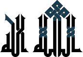
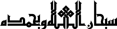
Kufi Fatimi played an important role in the artistic and architectural heritage of the Fatimid Caliphate — on mosque walls, domes, monuments, coins and religious manuscripts, where its decorative character enhanced both beauty and meaning. It remains a source of inspiration for Islamic artists, architects and contemporary calligraphers.
Style variations
A distinctive feature of Kufi Fatimi is the wide variety of letterforms: several letters can be written in multiple artistic ways while keeping their identity (glyph variations). The letter Dal can be drawn in more than 40 variations and the letter Ha has over 20 recognised forms, so no two Kufi Fatimi compositions are exactly alike.

Modern Kufi
A contemporary interpretation of Kufic
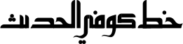
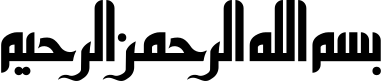
Modern Kufi is a contemporary variation of traditional Kufic. It preserves the bold geometric structure of classical Kufic while introducing cleaner lines and a more minimal appearance — widely used in modern graphic design, branding and Islamic artwork for its balance, simplicity and strong visual impact.
Origins and development
It has no single inventor or specific historical origin. It developed through the work of contemporary calligraphers and designers who adapted classical Kufic for modern applications. Inspired by Kufic’s geometric foundations, they simplified the letterforms and refined the proportions to work well in both digital and printed media.
Nuances and characteristics
- Based on the geometric structure of classical Kufic.
- Simplified letters with clean, balanced proportions.
- Straight lines and geometric shapes throughout the composition.
- Reduced decorative detail for a modern, minimal appearance.
- Highly suited to logos, branding, typography and contemporary Islamic artwork.

The role of Modern Kufi in contemporary design
It is one of the most popular styles in contemporary Arabic design — logos, brand identities, architectural graphics, Islamic wall art and digital typography — combining the historical character of Kufic with the simplicity required for modern visual communication.
Kufi Mushafi
Inspired by the script of early Quranic manuscripts


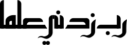
Kufi Mushafi is inspired by the early Kufic script used in some of the earliest handwritten copies of the Holy Quran. Its name comes from Mushaf, meaning a written copy of the Quran. Known for its bold geometric structure and disciplined proportions, it reflects the simplicity and dignity of early Islamic calligraphy; these examples are contemporary interpretations that preserve its character for modern design.
Historical origins and evolution
The original Kufi Mushafi developed from early Kufic during the 7th and 8th centuries. As the Holy Quran was carefully copied by skilled scribes, calligraphers refined the script into a clear, structured style suited to manuscripts. Although later scripts such as Naskh gradually replaced it for manuscript writing, it remains an important part of the history of Islamic calligraphy.
Nuances and characteristics
- Based on simple geometric letterforms.
- Strong horizontal and vertical strokes.
- Balanced proportions and orderly spacing.
- Decorative elements kept to a minimum for clarity.
- Contemporary interpretations refine the letterforms while preserving the original character.

The role of Kufi Mushafi in Islamic culture
The original Kufi Mushafi helped preserve the Holy Quran during the early centuries of Islam, used by scribes to produce handwritten manuscripts passed down through generations. Today it continues to inspire calligraphers and designers who value its historical significance and geometric beauty.

Modern Fusion
A contemporary expression of Arabic calligraphy
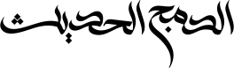

Modern Fusion is a contemporary style of Arabic calligraphy that combines the beauty of traditional Arabic scripts with modern artistic expression. Inspired by the innovative approach of the Iraqi calligrapher Wissam Shawkat, it blends classical principles with creative letterforms and balanced compositions.
Origins and development
Modern Fusion is not a historical Arabic script but a contemporary artistic style. It draws inspiration from the creative philosophy of Wissam Shawkat, whose work showed how traditional Arabic calligraphy could be reimagined through modern design. Calligraphers have developed their own interpretations by combining elements from different classical scripts while creating original compositions.
Nuances and characteristics
- Combines elements from different classical Arabic scripts.
- Smooth, balanced and visually dynamic letters.
- Traditional proportions adapted into a modern artistic style.
- Flexible while maintaining readability.
- Primarily used for decorative calligraphy, logos and contemporary Islamic artwork.

The role of Modern Fusion in contemporary design
Modern Fusion is used across today’s creative industry for decorative calligraphy, logos and contemporary Islamic artwork, bringing together tradition and innovation in a single artistic style.
Style variations
Since the style encourages creativity, calligraphers develop different interpretations while preserving the same contemporary character. Style 1 is cleaner and more balanced with smooth flowing letterforms; Style 2 is more expressive and dynamic, using stronger curves and bolder artistic forms.

Thuluth Maghribi
A fusion of two calligraphic traditions
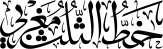
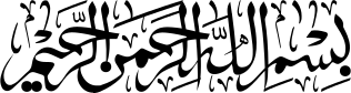
Thuluth Maghribi is a contemporary style that combines the elegance of Thuluth with the distinctive character of Maghribi. It blends Thuluth’s flowing curves and balanced proportions with the expressive shapes of Maghribi writing — a decorative, easily recognised style popular for Islamic artwork and wall pieces.
Origins and development
It has no single inventor or documented historical origin. It is a modern interpretation that combines elements from two well-known scripts. As digital calligraphy and contemporary Islamic art became more popular, calligraphers experimented with traditional scripts to create new visual styles; Thuluth Maghribi is one example of this creative approach.
Nuances and characteristics
- Long flowing curves inspired by Thuluth.
- Rounded, expressive shapes influenced by Maghribi writing.
- Bold, decorative and visually balanced compositions.
- Letters connect smoothly to create continuous artistic forms.
- Mainly used for decorative calligraphy rather than everyday writing.
The role of Thuluth Maghribi in contemporary design
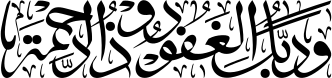
It is widely used in modern Islamic art and digital calligraphy — wall art, decorative panels, logos and religious artwork — where a traditional appearance is combined with a fresh artistic style.
Style variations
The expressive letterforms of Thuluth Maghribi lend themselves naturally to standalone artistic compositions — where the calligraphy itself becomes the centrepiece of the piece.
See any style on your chosen stone
The configurator shows all three front panel phrases at once — in your chosen style and inscription colour — on the live 3D preview.